Web designing is a process where art meets technology. This area continues to evolve with changing demands of internet users and the addition of new technologies. In order to sustain in constantly growing web world, the companies must refine their websites as per the latest trends.
Some website design trends which are gaining popularity in the digital world include:
1. Long scrolls
Last few months have witnessed the increase in the popularity of long scrolls where site visitors can continuously scroll down without visiting a new page. This trend had its roots in smartphone boom that took place in recent years. Also, it makes storytelling process easier for brands which constantly attempt to make stronger connection with the consumers through creative marketing campaigns. The rising popularity of products like smart watches will ensure that long scrolls never go out of fashion. In fact, several websites will adopt the evolved version of this feature in upcoming years.
2. Card Layouts
The website card layouts can be used in any website to make the content more scannable for the visitors. This trend was popularized by Pinterest and since then every website with heavy content looks forward to implement this technique. The cards are optimum for reading stuff on mobile devices and gadgets with different screen sizes. Several firms offering web design services are increasingly recommending this visually appealing design to their clients.
3. Animations
In above point, we discussed how brands are using storytelling to connect with the target users. And animation is the best medium to prepare a story that hits the chord among viewers. It is essential to keep the animation crisp and simple and complicated ones may confuse the website visitors. Loading animations which makes sure that user does not get irritated while loading or connecting on an internet page are also prevalent these days.
4. Microinteractions
The microinteractions are an inevitable part of great website design in present era where focus is on user interaction. Microinteractions are basically small interactions by user on a website or application like changing of the settings; liking a specific post or turning off a specific feature. These interactions make the users more comfortable with the website and enhance the engagement. In order to make most out of them, microinteractions must be perfected prior to their activation on the website.
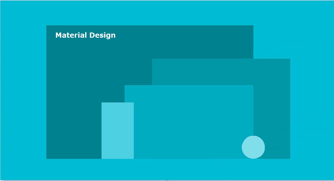
The concept of material design was launched by Google Inc. in 2014. It uses concepts like shadows, elevation, padding and object relationships for creating realistic designs on a website. In present scenario, this design is being implemented in both android applications and website domain.
6. Use of HTML5 instead of flash
Online web solution providers are mainly implementing HTML5 for designing websites that are compatible to the mobile devices. Also, this language is gaining popularity as the text in it is more search engine friendly. On the other hand, flash is slowly fading away from the digital world.
7. Bold colors
Bold is the new normal in terms of website designing. 2015 already witnessed use of bold colors due to emotional energy linked to them. These vibrant colors specially match with bold attitude of youth across the nation. These bold colors also help in grabbing attention of users on call to action buttons present on the webpages. More and more websites are expected to implement use of bold palettes this year.
8. Full-screen slides
In this design, the whole screen gets replaced by a fresh content. The slides change through scroll, click or through timed effect. It helps in building a positive first impression for the brand among the website visitors. Each slide may also have different call to action buttons related to the unique content of the slide.
9. Creative navigation menus
Some creative navigation styles that are gaining popularity include vertical stacks, navigation menus on bottom and slide-out menus. Hamburger menu (3 horizontal parallel lines) was quite popular but was linked to criticism by various design gurus.
Hamburger Menu
Conclusion
Reputed companies offering online web solutions have web designers who are proficient in all these designing trends. Business owners can use these services to turn their websites into a powerful source of useful information available in presentable manner.


